Interpretation of the results
Mini project 1
Figure 1: scatter plot of premature death and race
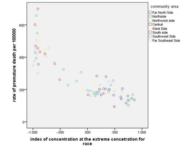
The above plot shows that the index concentration at the extreme concentration for race is not linearly related to the rate of premature death per 10000. The relationship between the rate of premature death and the index of concentration at the extreme concentration for age is curved. This can be made linear using the log transformation for the rate of premature death per 100000. At a low index of concentration for the race, the rate of premature death is higher and reduces as the extreme concentration for rate increases.
Figure 2: scatter plot of gdp and race
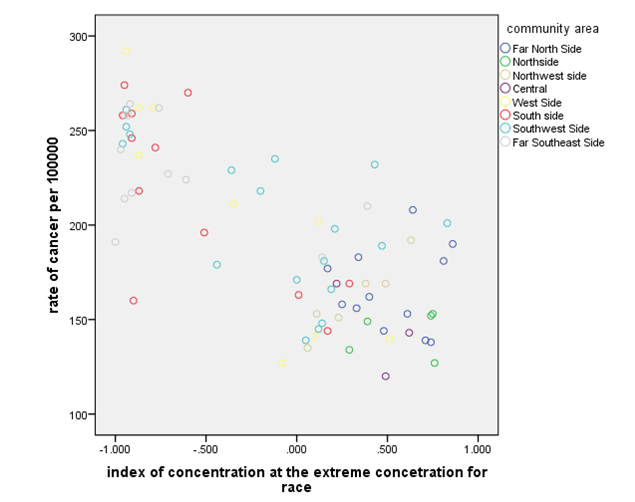
The above chart shows that race and cancer are not linearly related. It shows that the rate of cancer per 100000 reduces as the index concentration at the extreme concentration for race increases. Further, the rate of cancer per 100000 is more clustered at higher index of concentration at the extreme concentration for the race.
Figure 3: scatter plot of cancer and race
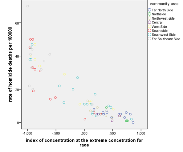
The above plot shows that the rate of homicide death and the index of
concentration for the race are not linearly related. They have a polynomial
relationship. It’s clear from the plot that the rate of homicide deaths
decreases as the index of concentration for race increases.
Table 1: Summary descriptive statistics
| Statistics | |||||
| index of concentration at the extreme concentration for race | rate of premature death per 100000 | rate of homicide deaths per 100000 | rate of cancer per 100000 | ||
| N | Valid | 77 | 77 | 77 | 77 |
| Missing | 0 | 0 | 0 | 0 | |
| Mean | -.10468 | 283.92 | 18.13 | 194.29 | |
| Median | .11000 | 226.00 | 11.00 | 189.00 | |
| Mode | -.950a | 172a | 5 | 169 | |
| Std. Deviation | .622175 | 143.711 | 16.521 | 45.666 | |
| Variance | .387 | 20652.731 | 272.930 | 2085.365 | |
| Minimum | -1.000 | 94 | 0 | 120 | |
| Maximum | .860 | 699 | 70 | 292 |
The N in the above summary statistics indicates that all observation in all the variables listed above were 77 and there was no missing observation in the dataset.
Mean:
The average for the index of concentration at the extreme concentration for the race is -10468. This means that observation in this variable will be around -10468. The average for rate of premature death per 100000 is 283.92 implying that observation of this variable lies within 283.92. The average rate of homicide deaths per 100000 indicates that most of the observations lie within 18.13. While the average rate of cancer per 100000 lies within 194.29 of all the observations
Median:
The median for index concentration for race indicates that the medium value is -11000, median for the homicide deaths indicates that there the medium value for all the observations is 226, the median for the rate of cancer indicates that the medium value for all observations is 11 and the median value for premature death is 189.
Mode:
-950 indicates that the most occurring value for the race is -950, the most occurring value for the homicide death is 172, the most occurring value for the rate of cancer is 5, and the most occurring value for premature death is 169.
Std deviation
The std deviation indicates as follows respectively; the race is spread around the mean 0.622175 times, the homicide death is spread around the mean 143.711 times, the rate of cancer is spread around the mean 16.251 times, and the premature death are spread around the mean 45.666 times (Lawrence and Lin, 2009).
Minimum value:
The minimum value for the race is -1, the minimum value for homicide death is 94, the minimum value for the rate of cancer is 0, and the minimum value for the premature death is 120
Maximum value:
The maximum
value for the race is 0.86, the maximum value for homicide death is 699, the
maximum value for the rate of cancer is 70, and the maximum value for the
premature death is 292
Miniproject 2
Table 1: Independent Sample t test for the Mean difference
| 2Independent Samples Test | |
| t-test for Equality of Means |
| Df | Sig. (2-tailed) | Mean Difference | |||
| rate of premature death per 100000 | Equal variances assumed | 75 | .000 | -164.219 | |
| Equal variances not assumed | 66.588 | .000 | -164.219 | ||
| rate of cancer per 100000 | Equal variances assumed | 75 | .000 | -54.959 | |
| Equal variances not assumed | 74.959 | .000 | -54.959 | ||
| rate of homicide deaths per 100000 | Equal variances assumed | 75 | .000 | -20.172 | |
| Equal variances not assumed | 55.987 | .000 | -20.172 |
H0: There is no difference in means
H1: at least one of the mean is different
Using the result in the table above we reject the null hypothesis and conclude that at least one of the means or all are different from the others. This implies that the mean difference is not equal to zero. A post hoc test may be conducted to determine which is different.
Table 2: The Mann-Whitney U Test for the Mean Difference
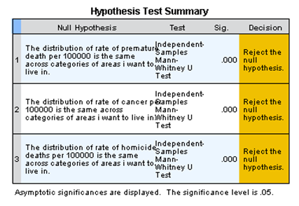
Using the hypothesis formulated above, from the table2 above we reject the null hypothesis and conclude that the mean for the variables was different (Spiegel and Stephens, 2017). This means that the two tests yield the same conclusions and the all lead to the rejection of the null hypothesis.
Table 3: one-way ANOVA
| rate of cancer per 100000 | |||||
| Sum of Squares | Df | Mean Square | F | Sig. | |
| Between Groups | 43621.345 | 2 | 21810.672 | 14.051 | .000 |
| Within Groups | 114866.370 | 74 | 1552.248 | ||
| Total | 158487.714 | 76 |
H0: The three categories are not significant
H1: at least one of the three categories is statistically significant
From the ANOVA table above we reject the null hypothesis under conclude that at least one or all the three categories were statistically significant in explaining the model (Greenhalgh,2007). This means that there regression coefficients are not equal to zero. Additionally, a unit change in the three categories result to a change in the response variable.
Table 4: Kruskal Wallis
| Ranks | |||
| areas i want to live in | N | Mean Rank | |
| rate of cancer per 100000 | want to live in | 26 | 21.31 |
| i dont want to live in | 51 | 48.02 | |
| Total | 77 |
From the table 4 above based on the hypothesis formulated in table 3, we reject the null hypothesis and conclude that at least one of the three categories is significant in explaining the model (Liu et al, 2003). This implies that the one way ANOVA test and the nonparametric test have the same conclusion which result to the rejection of the null hypothesis. Therefore, there the three categories groups are statistically significant in explaining the response variable.
| Test Statisticsa,b | |
| rate of cancer per 100000 | |
| Chi-Square | 24.559 |
| Df | 1 |
| Asymp. Sig. | .000 |
Table 5: Testing for correlation using the Pearson Correlation Test
| Correlations | ||||
| rate of cancer per 100000 | premature mortality2 | rate of homicide deaths per 100000 | ||
| rate of cancer per 100000 | Pearson Correlation | 1 | .786** | .750** |
| Sig. (2-tailed) | .000 | .000 | ||
| N | 77 | 77 | 77 | |
| premature mortality2 | Pearson Correlation | .786** | 1 | .736** |
| Sig. (2-tailed) | .000 | .000 | ||
| N | 77 | 77 | 77 | |
| rate of homicide deaths per 100000 | Pearson Correlation | .750** | .736** | 1 |
| Sig. (2-tailed) | .000 | .000 | ||
| N | 77 | 77 | 77 |
From the table, we can see that using the Pearson there is a positive correlation between the dependent variables and the two measures created. This implies that any unit increase in each of the two measures results into an increase of the response variable.
Table 6: Testing for correlation using the spearman correlation test
| Correlations | |||||
| rate of cancer per 100000 | premature mortality2 | ||||
| Spearman’s rho | rate of cancer per 100000 | Correlation Coefficient | 1.000 | .781** | rate of homicide deaths per 100000 |
| Sig. (2-tailed) | . | .000 | .710 | ||
| N | 77 | 77 | .000 | ||
| premature mortality2 | Correlation Coefficient | .781** | 1.000 | 77 | |
| Sig. (2-tailed) | .000 | . | .784** | ||
| N | 77 | 77 | .000 | ||
| rate of homicide deaths per 100000 | Correlation Coefficient | .710** | .784** | 77 | |
| Sig. (2-tailed) | .000 | .000 | 1.000** | ||
| N | 77 | 77 | 77. |
From the above table, using the Spearman’s correlation coefficient it clearly indicates that there is a positive correlation between the dependent variable and the independent variables. This implies that a unit increase of the explanatory variable leads to an increase in the response variable. For the Pearson test for correlation and the Spearman nonparametric test yield the same conclusion of the existence of positive correlation between the response variable and the explanatory variable. This implies that the two test for correlation do not contradict each other.
Mini project 3
Table 1: Linear regression
| Model 1 | Model 2 | Model 3 | Model 4 | Model 5 | |
| Hardship index | 5.188*** (0.808) | -0.741 (1.038) | |||
| Race | -201.6455*** (13.008) | -124.965*** (21.824) | |||
| Gdp | -0.005*** (0.001) | 0.000 (0.0001) | |||
| Unemployed | 17.505*** (1.218) | 9.086*** (1.981) | |||
| Constant (standard error) | 56.123 (37.77) | 262.815 (8.155) | 412.335 (27.410) | 51.03 (18.299) | 189.346 (71.69) |
| Adjusted R-squared | 0.347 | 0.759 | 0.274 | 0.730 | 0.807 |
| *p<0.05,**p<0.01,***p<0.001 |
Interpretation of the linear regression models
Model 1 indicates that the rate of premature deaths increases by 5.188 units per unit change in the hardship index. The adjusted R-squared for model 1 that is 0.347 indicates that hardship index explains the variability of the model by 34.7% which means that hardship fits the model poorly.
Model 2 indicates that premature deaths decrease by -201.6455 units per unit change race index. Model 2 has an adjusted r-squared of 75.9 % meaning that race index explains 75.9 % of the model while the remaining percentage is explained by other factors, not in the model. This implies that race index fits the model in a better way.
Model 3 indicates that premature death decreases by 0.005 units per unit change in gdp. Further, the model has an adjusted r squared of 27.4 %. This implies that gdp explains only 27.4 of variability in the model. Thus gdp fits the model poorly (Mahbubul et al, 2012).
Model 4 indicates that premature death increases by 17.05 units per unit change in unemployment. The model has an adjusted r-squared of 73.07%. Which that unemployment explains 73.07% of the variability of premature death (Norusis, 2013). Unemployment fits the model in a better way based on its adjusted r-squared.
Model 5 represents the full model containing for explanatory variables which are; gdp, unemployment, race, and hardship index. The model has the highest adjusted r-squared indicating it is the best model for the four models. The coefficients of the gdp in the model indicates that it has very small on the changes of the premature death holding the other three predictors fixed.
Table 2. Logistic regression
| Model 1 | Model 2 | Model 3 | Model 4 | Model 5 | |
| Hardship index | 1.06*** | 0.705* | |||
| Race | -4.955*** | 0.00** | |||
| Gdp | 1.00** | 1.00** | |||
| Unemployed | 1.485*** | 1.310 | |||
| Constant (standard error) | 0.078 | 0.953 | 7.983 | 0.008 | 1032097677 |
| Adjusted R-squared | 0.222 | 0.746 | 0.248 | 0.591 | 0.806 |
| *p<0.05,**p<0.01,***p<0.001 |
Interpretation of the Logistic Regression Models
Model 1 indicates that the odds of premature death increases by 1.06 times per unit increase in the hardship index. The p-value also indicates that the hardship index is statistically significant in explaining the model (Cabrera,2014).
Model 2 indicates that the odds of premature death decreases by 4.955 times per unit increase in the race index. Its p-value also indicates that race is statistically significant in explaining model 2.
Model 3: indicates that the odds of premature death increases by 1 times per unit increase in the gdp. Statistically, this implies that the gdp has no effect on premature death.
Model 4:
indicates that the odds of premature death increases by 1.485 times per unit increase in the rate of unemployment. Its standard error is small indicating that unemployed will have a higher z-score implying that is statistically significant in explaining model 4.
Model 5:
The model represents the overall model. The coefficients in model 5 can be interpreted as follows; the odds of premature death increases by 0.705 time per unit increase in the hardship index holding the other predictors variables fixed., the coefficient 0.00 can be interpreted that the odds of premature death does not change with increase in the race index, this means that race is not statistically significant in the model holding others predictors fixed. Coefficient 1.00 indicates that the odds of premature death increases by 1 times per unit increase in gdp holding other predictors’ variables fixed and coefficient 1.31 indicates that the odds of premature death increases by 1.31 time per unit increase in unemployment rate holding other explanatory variables fixed. Finally, the full model is the best model because it has the highest adjusted r-squared of 80.6 % (Sweet, 2009).
References
Cabrera, A. F. (2014). Logistic regression analysis in higher education: An applied perspective. Higher education: Handbook of theory and research, 10, 225-256.
Greenhalgh, T. (2007). How to read a paper: Statistics for the non-statistician. II:“Significant” relations and their pitfalls. BMJ, 315(7105), 422-425.
Lawrence, I., & Lin, K. (2009). A concordance correlation coefficient to evaluate reproducibility. Biometrics, 255-268.
Liu, R. X., Kuang, J., Gong, Q., & Hou, X. L. (2003). Principal component regression analysis with SPSS. Computer methods and programs in biomedicine, 71(2), 141-147.
Mahbubul, I. M., Saidur, R., & Amalina, M. A. (2012). Latest developments on the viscosity of nanofluids. International Journal of Heat and Mass Transfer, 55(4), 874-885.
Norusis, M. J. (2013). SPSS: SPSS for Windows, base system user’s guide release 6.0. SPSS Inc.,.
Spiegel, M. R., & Stephens, L. J. (2017). Schaum’s outline of statistics. McGraw Hill Professional.
Sweet, S. A., & Grace-Martin, K. (2009). Data analysis with SPSS (Vol. 1). Boston, MA: Allyn & Bacon.