Introduction
The report is about online furniture website where users can purchase the furniture from the website when they visit it. The website is made from different technologies like HTML, JavaScript and bootstrap. that makes it to be more attractive.
React is a framework that has been used ensuring this project works perfectly from front end. There are online CDN libraries like for bootstrap which have been use to improve the appearance ls the website to the final user during the usage process.CSS also plays a big role by manipulation the pages to be more feasible and easy under, (Huynh et al, 2016)
Registration page
The website allows users to get registered on the platform for them access the services that are offered on the web page. The diagram below shows a form that is used for the registration purposes be users of the website. As shown from the figure, other are several textboxes where users enter information to be registered into the database are given also. The options as shown on the figure include the name, phone number, email aid and password. All this are placed upon the textbox then store onto the database for usage by the user of the system. The data gibe to the database is the online that will be use on the by users to login to the system and do necessary activities as you can see. Also, colors have been used on the page to for easy understanding of the web page developers.
Fig: Showing registration process on the website
Login page
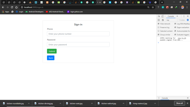
The diagram below shows the login page of the website, the page is composed of the phone and the password that is registered by the users. Both details are entered by the means of the textbox. The labels the page are used to guide a use on the necessary details to be entered on the textbox of the page. The page also has a background color as white to allow easy feasibility on the website when the users are using the website.

Fig: Sowing sign in page
Main page
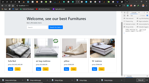
The system main page shown below shows the implementation of the system. The page Is of picture on furniture’s that shows the furniture to be purchased from the website. The page is also having prices of the respective furniture that are bought. As shown from the page, beautiful colors have been used on the page to allow easy understanding of the website page by the user. Blue color is the most frequently attractive color on most website. The color also has been used on the website to shows how it’s really important in play a role of the website development. The page has also a search box where users type few characters and the necessary furniture displays on the page for the user to use.
On the background, the page is given the white color for easy feasibility of the details inside the website and the web page.
On the bottom of the page, the user is given the options view or to by the furniture, as you can see they are given blue and yellow color for easy feasibility towards the futures of the website
If the user clicks on the view button, he will only see few details of the website and that will be the end.
But if the user chooses the buy option, the user will be directed to the web page where he will buy the furniture in his comfort zone

Fig: Showing main page.
View page
The figure below shows a view page of the website, if the user doesn’t want to buy the furniture form the home page, he is directed to v the view page. Here on the page the details of the furniture are displayed.
From the figure below, the image and the price of the necessary furniture is displayed on a page. On the background also white color is given for easy feasibility of the website by the user. On top of the page also the user is give a blue color button showing threat the user can exit from the project.
The prices and the furniture names have been given a black color for feasibility of the website. The page also can be seen designed in form of the card view format to make it more clearly with the images it has on the web page. On other hand, the prices are given in form of the US dollars so that its universally understanding by the whole users who come to the site for purchasing furniture.

Fig: Showing View page of the website
Recommendation
My recommendation on the website is for the system should start adopting discounts on the customers who purchase several furniture’s from the web page. This will increase the number of the customers visiting the page and hence increase the amount of traffic at the web site.
On the basis of the loyal customers, the website should capture the history of what they have purchased. They should be given special attention priority hence their list should be store on a separate platform.
The website should also allow something like payments system for the product purchased like the furniture, hence reducing the physical movement of the customers to the store online
Conclusion
Through the website have learnt a lot in the development process. Have gained the experience on how to use react, HTML, CSS, bootstrap and JavaScript on how of use them on the web page development. Through this I fill confident as a web developed that can use the knowledge of programing to impact business people in a special way.
Finally, I was faced with several challenges during the development process. The problems of the react rendering process on the page. But by using online sources I managed to maneuver with the code and overcome the errors that were arising during the development process. On other hand, connection to the database really brought wastage of time in my development process. But I used the stack overflow resources to deal with the errors that were arising on the page for connection process, (Zhu et al, 2015).
References
Huynh, H.T., Nkamga, V.D., Signoli, M., Tzortzis, S., Pinguet, R., Audoly, G., Aboudharam, G. and Drancourt, M., 2016. Restricted diversity of dental calculus methanogens over five centuries, France. Scientific reports, 6, p.25775.
Zhu, J., Shen, B., Cai, X. and Wang, H., 2015. Building a Large-scale Software Programming Taxonomy from Stackoverflow. In SEKE (pp. 391-396).