Welcome to your hands-on activity! This assignment allows you to work with Tableau using some of our real-world data sets. You will:
- Download the attached spreadsheet and upload those data sets into Tableau.
- Go through this document and use Tableau to answer all the questions listed below. Where applicable, paste screenshots into the template below.
- When you are ready, complete the online quiz, which verifies your homework. Use the answers you found in this document to answer the questions.
- When you have completed the online quiz, submit the Word document.
- Remember, you can always ask your instructor for help if needed.
- If you need to adjust the size of your visualizations to match the options in the questions, use the “Format”-> “Cell size” options. For example, “Ctrl+Shift+B” on a Windows computer will make the visualization bigger, and “Ctrl+Up” will make it taller.
The spreadsheet attached to this assignment contains two Excel datasets:
- U.S. State data.xlsx
- 2022 NYC Restaurant Inspections.xlsx
**Save your Tableau file as Chapter 1, you will reuse some of the visualizations in later assignments**
Analyze the US State Data Set
To begin,
- First download both the US State and the NYC Restaurant data files from your LEO classroom to your computer.
- Launch Tableau and select an Excel file.
Open the US State Data.xlsx Excel file. You should see the data as follows, and be able to verify the Alabama population is 5,074,296.
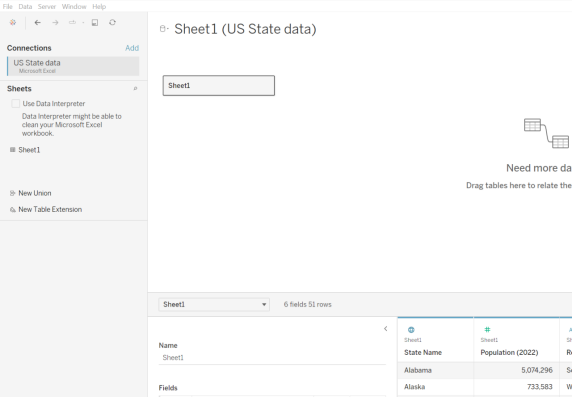
You can now click the “Sheet 1” tab on the bottom toolbar to create your visualizations. You should create a new worksheet for each question.
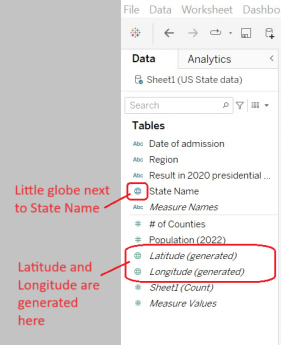
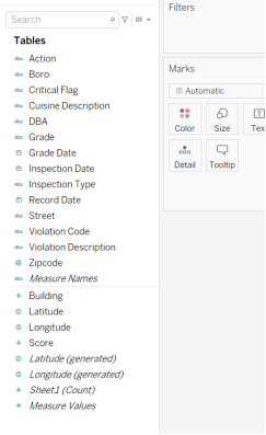
Before we jump into building visualizations, let’s look at the data we have loaded. Under the tables area, you should see all the fields in the dataset.
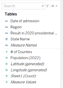
After you have looked carefully at them, answer these questions about the nature of the data we are looking at. As you can see, this is basic information about the states in the United States, including the date it was admitted, the region, the result of the 2020 presidential election, the name, the number of counties, and the population in 2022. Tableau generated latitude and longitude coordinates. The “Sheet1 (Count)” and “Measure Values” are also generated by Tableau. Often, we use these to help us do simple counts on data.
Question 1 – Measures and dimensions
In the U.S. States data set, which one of these fields is a measure?
- State Name
- Population
- Date of admission
- Region
| Question 1 Answer: | B. Population |
Question 2 – Discrete and continuous fields
Which of these fields is continuous in the U.S. States data set?
- State name
- Population
- Date of admission
- Region
| Question 2 Answer: | B. Population |
Question 3 – Bar charts
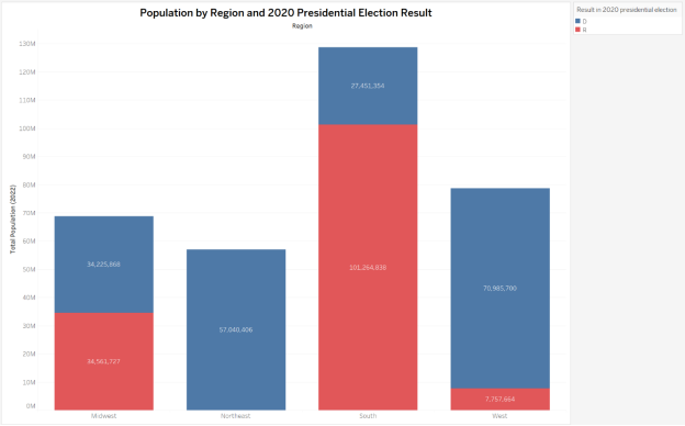
For your first visualization, you will create a stacked bar chart. Drag the “region” field into columns and the “Population (2022)” field into rows. You’ll notice that Tableau automatically aggregated the population and created a sum or total of the population. This is fine for now; as you learn more about Tableau, you will learn when using the default aggregations is inappropriate.
Next, add “Result in the 2020 presidential election” to the color area under the Marks setting. You should now have a stacked bar chart.
Question 3 – Which region had the closest divide between the 2020 Presidential Election results?
A. Midwest
B. Northeast
C. South
D. West
| Question 3 Answer: | A. Midwest |
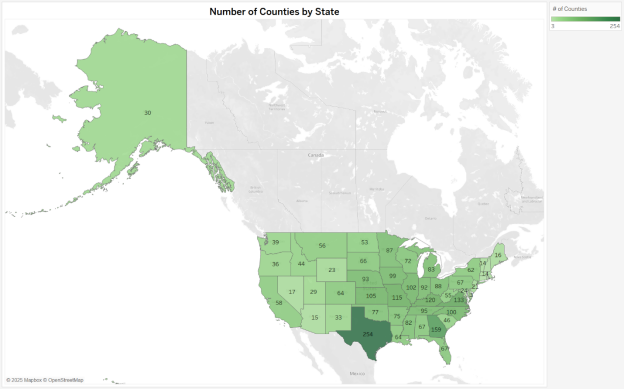
Question 4 – Density maps
We are going to create a map using the U.S. State data. First, ensure that Tableau recognizes the “State Name” as geographic data. You should see a little globe next to the State Name, and you should also have latitude and longitude in your dataset (notice that Tableau automatically added this; it wasn’t in the original dataset).
At the bottom, click on the “+ Worksheet” to make a new Sheet, Sheet2.
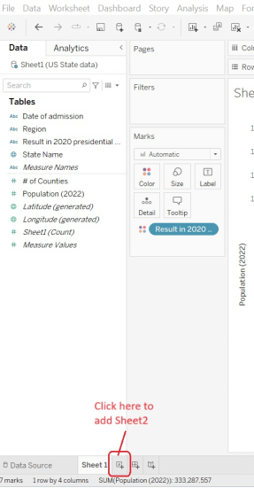
Go to Sheet 2.
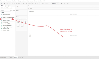
Drag “State name” onto your canvas. Tableau should automatically create a symbol map for you, with a dot on each state.
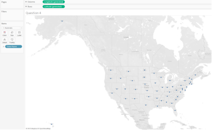
Next, add “# of Counties” field onto color and you should immediately see a density map.
Question 4 – For the state with the highest number of counties, how many counties does it have?
- 58
- 254
- 120
- 313
| Question 4 Answer: | B. 254 |
Analyze the NYC Restaurant Data Set
Question 5 – Line chart
Now, we will look at the other data set: 2022 NYC Restaurant inspections. This dataset is all about the health inspections of restaurants in New York City.
We will keep the US State data source open, and add to it the NYC Restaurant data source.
Go to the Data tab at the top and choose “New Data Source”
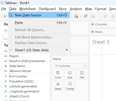
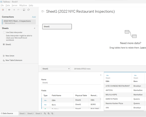
Connect to the Excel file which is the 2022 NYC Restaurant Inspections data. You should see the following as a confirmation that Tableau was able to open our restaurant data source. Note the “A FEI CHINESE RESTAURANT” should appear in the right bottom.
When restaurants have violations, they receive scores for each violation. So, restaurants want low scores, and high scores are not desirable. Grades A-C are assigned to restaurants based on their scores. For restaurants with scores of 0 to 13, they receive an “A”. If they score between 14-27, they receive a “B”. A “C” grade is 28 or more. If you would like to read more, check out https://a816-health.nyc.gov/ABCEatsRestaurants/#!/faq.
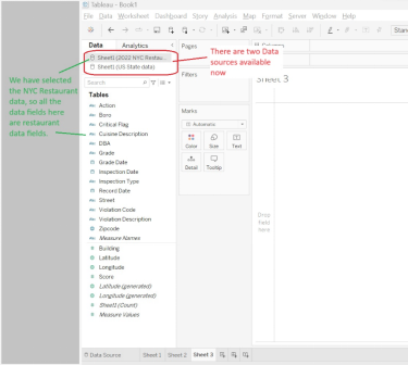
Let’s make a new worksheet (ours is called Sheet3). Note the Data will now have two options in it – our State data and our new Restaurant data. Make sure you choose the restaurant data set and can see data items like Cuisine Description.
Look through the dataset at the fields; what are the dimensions and measures?
We now assume you are in a new worksheet with the restaurant data active.
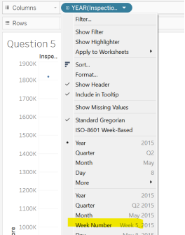
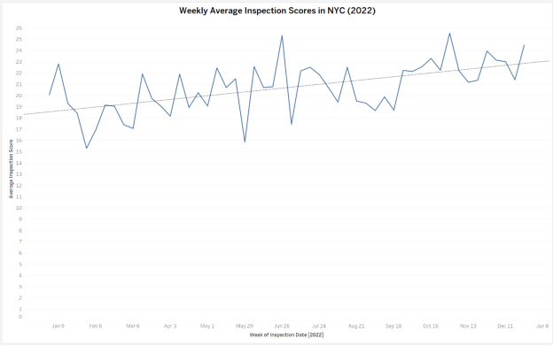
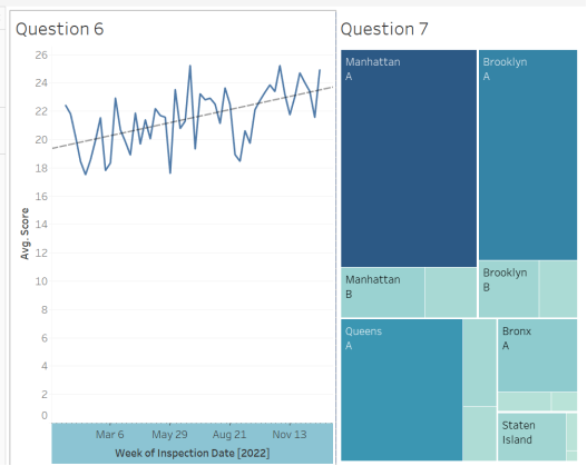
We will create a line chart of the change in score throughout the year. To do this, drag “Inspection Date” into the columns (we always have time on the x-axis) and then drag “Score” into the Rows (y-axis). You will see that the date defaults to “Year,” and Tableau, by default, totaled the sum of the scores. This is not a helpful chart. Change the Date to “Week Number”, and you will now see a line graph.
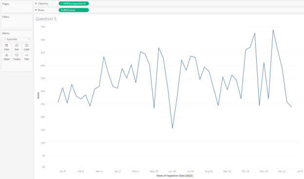
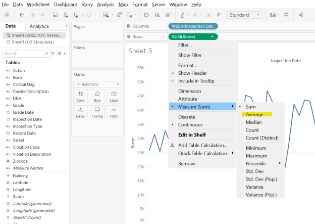
But if you look at the Score field in rows, you’ll notice it is totaling the scores of the inspections, but it makes more sense to look for average. So, change the Row Measure calculation to Average by clicking on the down arrow.
Question 5 – Is there any obvious pattern of average score behavior over time?
- Yes – there is an easy pattern to determine
- No — there is no obvious pattern

Question 6 – Trendlines
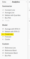
Let’s see if we can find any trend in the data. Click on the Analytics tab, select Trend Line, and drag it onto the graph. Select “Linear” to create a linear trendline.
Now, you should have your original line chart with the dotted trend line on top.
Question 6- Now that you have a trendline, how would you describe your findings? Hint: what does a score represent?
- Restaurant inspection scores are getting better over time.
- Restaurant inspection scores are getting worse over time.
- Both of these
- Neither of these
| Question 6 Answer: | B. Restaurant inspection scores are getting worse over time |
Question 7- Show me
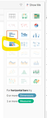
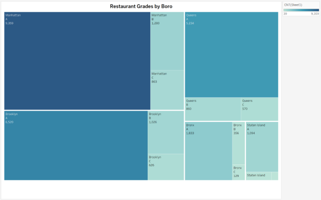
A helpful feature in Tableau is the “Show Me”. When you select fields, Tableau will automatically make recommendations using this feature to guide you. Let’s practice by creating a tree map of New York City Restaurant Inspections. Click on the following fields and hold down the control button to make sure they are all active: “Boro”, “Grade”, and “Sheet1 (Count)”. Click on the icon of the TreeMap. Notice that Tableau is telling you how many dimensions and measures you need for each visualization type.
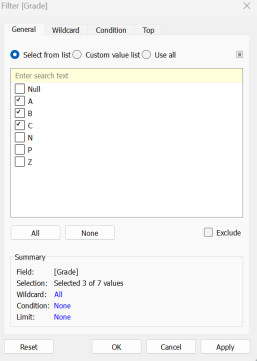
Drag “Grade” into the filters and ONLY select A, B, and C.
Drag the “Sheet1(Count)” field onto Label.
You should now have a tree map of the NYC Restaurants Inspections that were A, B, or C for each of the boros.
Question 7 – Which boro had the most “A” grades?
- Bronx
- Brooklyn
- Manhattan
- Queens
- Staten Island
| Question 7 Answer: | C. Manhattan |
Question 8 – Dashboards
If you created the dashboard below, which of the following could be added to this dashboard? Choose all that apply.
- Legends for Questions 6 and 7
- A text box for Question 6
- A title for the Dashboard
- None of these can be added to the dashboard.
| Question 8 Answer: | A, B, and C: All of these elements can be added to the dashboard. |