This assignment builds on our previous work through Milligan, Chapter 9, and takes a deeper dive into two key data visualization techniques: clustering and distribution analysis. Clustering can be a key technique for visualizing the relationships between two or more variables, moving from single dimensions into multidimensional analysis. Distribution analysis can highlight central tendencies in a dataset (such as mean or median) and allow visualization to show outliers clearly.
In this assignment, you will apply clustering and distribution analysis to analyze the relationships between several factors in a healthcare dataset by following these steps:
- Go through this document and use Tableau to answer all the questions listed below. Where applicable, paste screenshots into the template below.
- When you are ready, complete the online quiz, which verifies your homework. Use the answers you found in this document to answer the questions.
- When you have completed the online quiz, submit the Word document.
- Remember, you can always ask your instructor for help if needed.
- If you need to adjust the size of your visualizations to match the options in the questions, use the “Format”-> “Cell size” options. For example, “Ctrl+Shift+B” on a Windows computer will make the visualization bigger, and “Ctrl+Up” will make it taller.
Attachments:
- Diabetes2.csv (dataset downloaded from Kaggle):
- Pima Indians Diabetes Database
For this assignment, follow these steps:
- Download the Pima Indians Diabetes dataset
- Perform exploratory data analysis (EDA) of the data in Tableau
- Perform clustering analysis of the data in Tableau
- Perform distribution analysis of the data in Tableau
Download the diabetes dataset
- Click to access the Pima Indians Diabetes Database. You may need to sign in or register if you don’t already have an account on Kaggle. Click the “Download” button on the linked page above to download the dataset.
- You can scroll down on this web page to learn more about this dataset, including its original publication date and what the fields mean.
- When you download the data, it will save it as a .zip file, likely named something like “archive.zip” (a standard download protocol for Kaggle).
Alt text: standard download
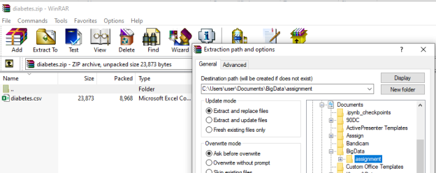
- Double-click on the “archive” file. It should open to a screen like the one below (this is from a Windows machine; if you are on a Mac, it may vary slightly). You will see that there is one file there (named diabetes.csv, highlighted with a green arrow below). If you click on the “Extract all” option, it will extract all the files (in this case, just the one diabetes.csv file). Save the file in a location of your choice, where it will be easy to find in order to connect with Tableau.
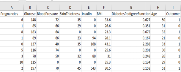
Open the dataset on your computer. It’s a .csv file, so it should open in Microsoft Excel, and it should look like the table below. Verify that you have these exact numbers showing up in your downloaded file:
Perform Exploratory Data Analysis (EDA) with Tableau
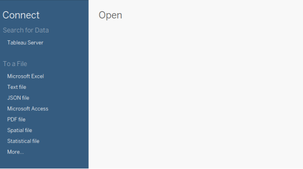
- Open the dataset in Tableau. Since this is a .csv file, and not an Excel file, you need to connect to a “more” kind of data (see image below):
Alt text: Data file
- When you open the file in Tableau, you should see something like this:
Alt text: Tableau file
- Before we do any multidimensional clustering, it’s always a good idea to get an overview of each of the data fields:
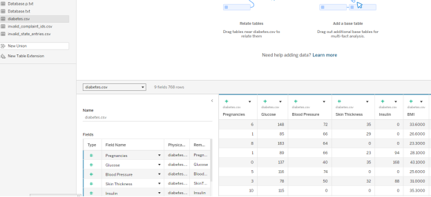
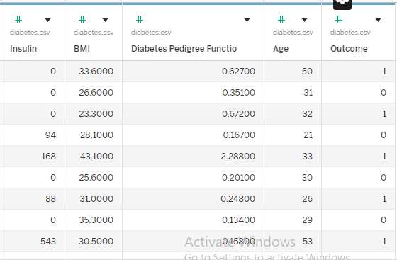
- There are 768 data rows here, each corresponding to a different member of the Pima Indian Tribe. The table contains each member’s number of pregnancies, blood glucose, blood pressure, and other health measurements. All the way to the right, the table also contains an outcome variable:
- 0 if the tribe member was not diagnosed with diabetes
- 1 if the tribe member was diagnosed with diabetes
- For example, let’s look at the Outcome for the first member. This person has had six pregnancies with a glucose reading of 148. If we scroll all the way to the right, we see the age listed as 50 and the Outcome listed as 1. This means this tribe member was diagnosed with diabetes.
- There are 768 data rows here, each corresponding to a different member of the Pima Indian Tribe. The table contains each member’s number of pregnancies, blood glucose, blood pressure, and other health measurements. All the way to the right, the table also contains an outcome variable:
Question 1: Understanding the Data
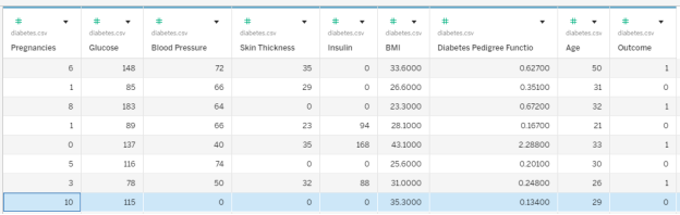
In the diabetes dataset, Row 8 contains a tribe member who reported ten pregnancies. Which other data fields correspond with this person?
- Glucose of 115, BMI 35.3, Outcome: No Diabetes
- Glucose of 115, BMI 35.3, Outcome: Diabetes
- Glucose of 168, BMI 38.0, Outcome: Diabetes
- Glucose of 168, BMI 38.0, Outcome: No Diabetes
- Glucose of 139, BMI 27.1, Outcome: No Diabetes
- None of these
| Question 1 Answer: | A. Glucose of 115, BMI 35.3, Outcome: No Diabetes |
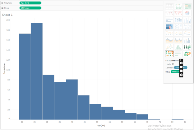
- Let’s explore the Pima Indians Diabetes Database a little bit more. Anytime you get a new dataset, it’s a good idea to run some general descriptives to see what the data look like. One of the major tools we use is a histogram.
Make a histogram of the age. On a new worksheet (below, Sheet 1), we first pull the Age to the Rows, and then, in the “Show Me” tab, we select the histog
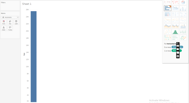

Alt text: histogram
Note that when it makes the histogram, under the Data tab, you can see a new variable under Tables called “Age (bin).” This is the histogram bin for your Age variable.
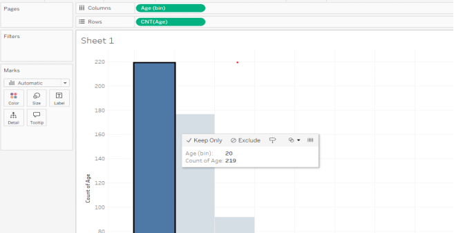
If we look at Sheet 1, we can see that most of our data points report an Age of between 20 and 30. We also have a few people in their 40s and 50s, and many fewer older people.
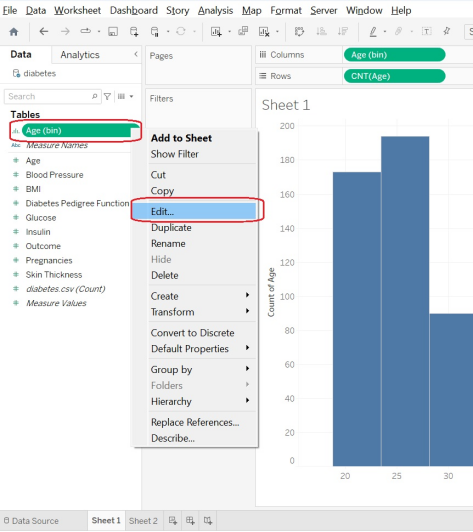
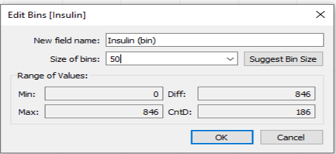
- Tableau does the best it can to guess at “good” bin sizes for your dataset, but it doesn’t always guess exactly the way a human would like. Go to the right of the green oval under the Data -> Tables -> Age (bin), pull that menu down, and select Edit to see the exact bin sizes Tableau is suggesting here.
Alt text: Data tables
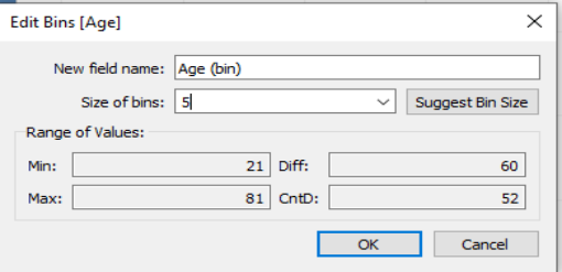
We can see here that Tableau is suggesting we group people in age groups of 4.69 years, and that our first bin is suggested to start at age 18.76. So the first bin will contain ages 21, 22, and 23. The second bin, due to rounding issues, contains ages 24, 25, 26, 27, and 28! Let’s update the bins so that they are of bin size 5, so that our yearly increments go in nice, round age buckets.
Alt text: Edit bins
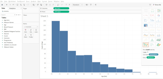
If we update the bin size to 5, we can now see that the histogram has adjusted slightly. The first bin contains ages 20, 21, 22, 23 and 24. The second bin contains ages 25, 26, 27, 28, and 29. The histogram is “smoother” in the jump between the 35–40 and 40–45 age bins.
Sometimes, the axis labels aren’t obvious. To be sure of which bin you are viewing, you can click on a bin, and it will display the information.
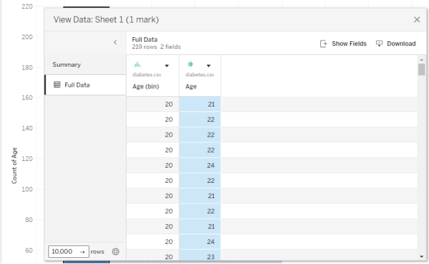
Below, we have clicked on one of the bars and learned it is the bin for ages 35 (and contains ages 35, 36, 37, 38, and 39 but not age 40). If you are curious, you can right-click on the bin and choose “View Data” and then “Full Data” to see the exact data points which make up that bar.
Alt text: histogram
- On a new sheet in Tableau, make a histogram of the BMI variable. Adjust the bin sizes so that they are size 5.
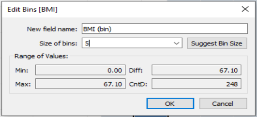
In your BMI histogram, what values are in the most frequent bin?
- 30–34.9
- 30–35
- 30.40, 135
- 30.40–33.30
- none of these
| Question 2 Answer: | B. 30–35 |
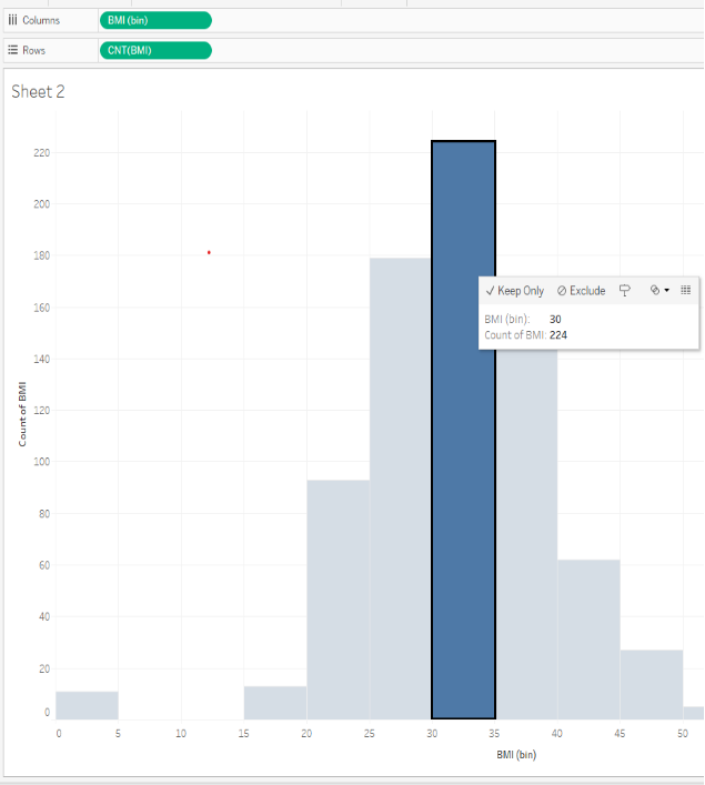
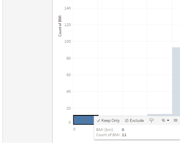
Question 3: Understanding Questionable Values
In your BMI histogram, are there any values that make you question the data and wonder if those should be filtered out?
- Yes; the data looks normally distributed, like a bell curve, and this is not expected for these sorts of measurements
- Yes; there are too many counts of a BMI of 40 and higher, which is much larger than expected
- Yes; there are 11 counts of a BMI of 0, which is probably not an accurate measure
- No; the data looks normally distributed, like a bell curve, and this is expected for these sorts of measurements
| Question 3 Answer: | C.Yes; there are 11 counts of a BMI of 0, which is probably not an accurate measure |
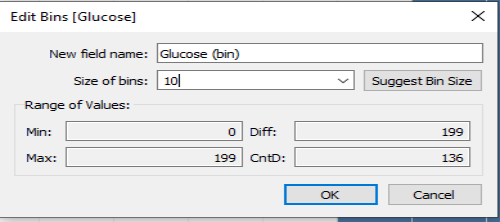
On a new sheet in Tableau, make a histogram of the Glucose variable. Adjust the bin sizes so they are size 10. (Don’t filter out any Glucose measurements at this point.)
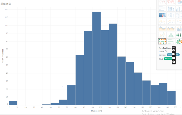
Question 4: Understanding the most frequent bins
In your Glucose histogram, what values are in the most frequent bin?
- 100 through 107, including 100 and 107
- 100 through 109, including 100 and 109
- 100 through 110, including 100 and 110
- 110 through 120, including 110 and 120
- 120 through 129, including 120 and 129
| Question 4 Answer: | B. | 100 through 109, including 100 and 109 |
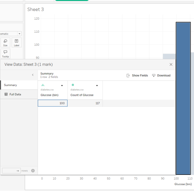
Question 5 – Understanding the bin values and counts
The most frequent Glucose measurement is about 100. What is the second most frequent Glucose measurement?
- bin 100, count 117
- bin 110, count 94
- bin 110, count 105
- bin 120, count 102
| Question 5 Answer: | D. bin 120, count 102 |
Question 6: Understanding the shape of the data
In your Glucose histogram, how would you describe the overall shape of this data?
- The average/median is about 100, and symmetric. It’s not skewed at all.
- The average/median is about 100, and it’s skewed to the right.
- The average/median is about 100, and it’s skewed to the left.
- It is bimodal: there are two distinct centers of glucose measurements, probably one for diabetes diagnoses and one for non-diabetes diagnoses.
- None of these
| Question 6 Answer: | B.The average/median is about 100, and it’s skewed to the right. |
Question 7: Understanding the Descriptives of the Data
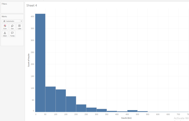
In your Insulin histogram, how would you describe the overall descriptives of this data?
- Zero insulin is meaningless, so there must be some mistakes.
- This data is normally distributed and follows a bell curve symmetric shape.
- This data is bimodal. We can see two distinct populations: those with diabetes and those without.
- The most frequent amount of insulin is between 0 and 49, but a few people report large levels of insulin, at 400 units or above.
- None of these
| Question 7 Answer: | D.The most frequent amount of insulin is between 0 and 49, but a few people report large levels of insulin, at 400 units or above. |
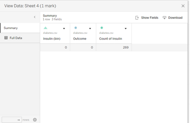
In your Insulin histogram, drag Outcome to the Color under Marks. Remember that Outcome=0 means No Diabetes, and Outcome=1 means Diabetes. Now go to the leftmost bin, right-click on it to View Data, and then look at the Full Data. How would you describe the data points in this bin? Check all that apply.
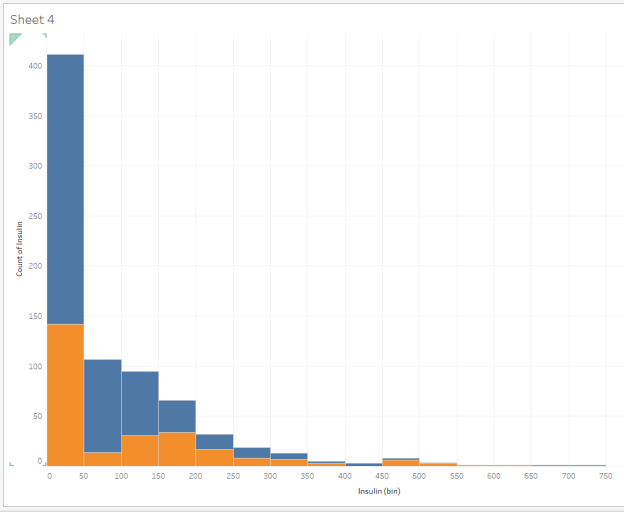
Question 8: Two-Dimensional Descriptives of the Data
How would you describe the data points in the leftmost bin in terms of insulin and outcome?
- The most frequent amount of insulin is 0, but there are some values here between 0 and 49.
- All the Insulin values here are 0.
- All the Outcome values here are 0 (no Diabetes).
- The values here average to 25.
- This contains only values from people with No Diabetes as their Outcome. If you have diabetes, you need insulin.
- None of these
| Question 8 Answer: | The most frequent amount of insulin is 0, but there are some values here between 0 and 49. |
Now, let’s look at the Outcome variable. We could make a histogram of this binary variable, but that’s not very satisfying. Let’s recode it to be a text variable. Instead of having to remember “0 means No Diabetes,” wouldn’t it be easier to just have the words “No Diabetes” showing on the screen?
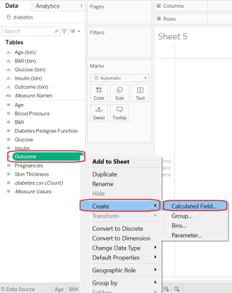
Fill it out as follows: You want to create a new field called “Outcome_Text,” and we want it to be “Diabetes” if the Outcome variable was a 1, 0 otherwise, and “NA” if, for some weird reason, the Outcome variable was neither a 1 nor a 0.
If you want to copy and paste the formula with all the glorious brackets and parentheses, here it is:
IF ([Outcome]=1)
THEN “Diabetes”
ELSEIF ([Outcome]=0)
THEN “No Diabetes”
ELSE “NA”
Alt text: copy and paste formula
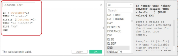
- Let’s check that it coded correctly:
- How many Outcome=0 do we have? Let’s look at a histogram of the original Outcome variable. Looks like we have 500 in the Outcome=0 bin and 268 in the Outcome=1 bin. (Those of you who are following along at home on your calculators will notice this is about 65% No Diabetes, 35% Diabetes.)
Alt text: copy and paste formula
- Let’s check that it coded correctly:
How many Outcome=0 do we have? Let’s look at a histogram of the original Outcome variable. Looks like we have 500 in the Outcome=0 bin and 268 in the Outcome=1 bin. (Those of you who are following along at home on your calculators will notice this is about 65% No Diabetes, 35% Di
Alt text: outcome
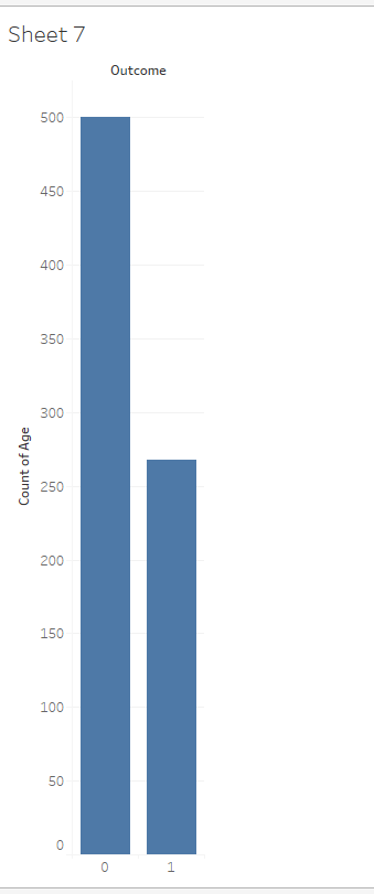
- How does our Outcome_Text = “No Diabetes” or “Diabetes” stack up against our original binary variable? Let’s drag the Outcome_Text to the Color and also to the Rows.
Alt text: outcome
- We can see success! The orange bar is marked “No Diabetes” in the legend, and it is showing on the left (per the binary Outcome variable = 0), while the blue bar is marked “Diabetes” in the legend and is showing on the right (per the binary Outcome variable = 1).
We are studying this dataset to try to understand diabetes in the Pima Indian tribe. We have a dataset which contains about 35% diabetes diagnoses.
Which research statement(s) does this data look like it might be able to answer? Check all that apply.
- Why do people with zero insulin recorded still have a diabetes diagnosis?
- What aspects of the modern diet cause diabetes?
- For the Pima Indian population listed in this dataset, are there any relationships between diabetes, age, and BMI which might be interesting?
- For the Pima Indian population listed in this dataset, are there any relationships between glucose, insulin, and diabetes diagnosis which might be interesting?
- For the Pima Indian population listed in this dataset, are there any relationships between household income, gender, and diabetes diagnosis which might be interesting?
- This is not enough data to ask anything; we really need to go to the CDC and get millions of rows of data.
- None of these
| Question 9 Answer: | Why do people with zero insulin recorded still have a diabetes diagnosis?For the Pima Indian population listed in this dataset, are there any relationships between diabetes, age, and BMI which might be interesting?For the Pima Indian population listed in this dataset, are there any relationships between glucose, insulin, and diabetes diagnosis which might be interesting? |
- Let’s go back to our Age histogram. Does diabetes diagnosis change with age? Pull the Outcome_Text (not the Outcome binary variable, but the Outcome_Text) as a color and also as an additional row variable. We will see something like this:
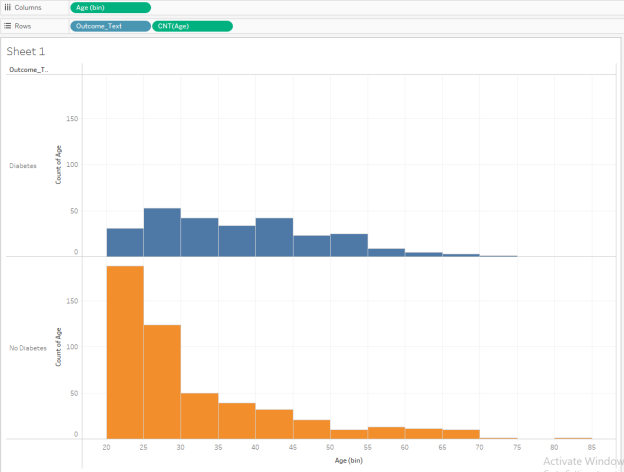
From this histogram, we can see that age starts off young on the left and goes to older on the right. The Diabetes population is on the top in blue, and the Non-Diabetes population is on the bottom in orange.
We can see that while both groups cover most of the full age range, the Non-Diabetes population has a lot of young people in it while the Diabetes population has a larger percentage of its population in the older age brackets.
This may give rise to a hypothesis: Does increasing age bring with it a likelihood of diabetes diagnosis among this population?
Question 10: Understanding Stacked Histograms
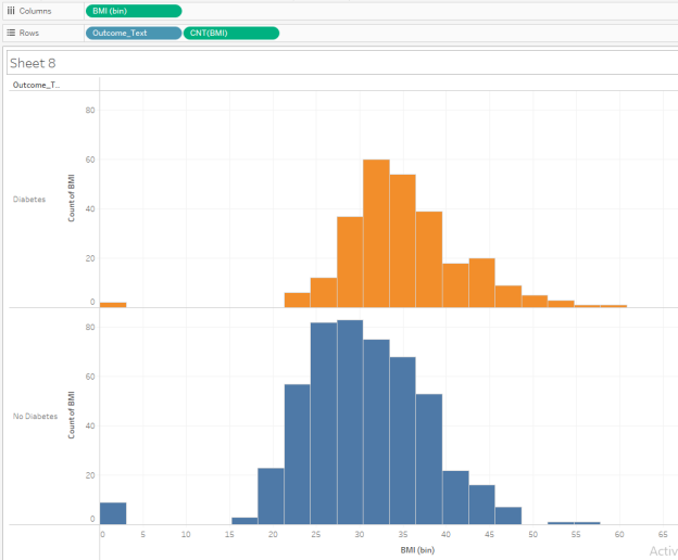
Go back to your BMI histogram. Be sure the bin sizes are still 5. (You can just ignore any BMI of 0; this is probably a data error.) Repeat steps similar to the Age histogram analysis we just did. Which statements do your stacked histograms support for the Pima Indian population from this dataset? Check all that apply.
- The BMI for the No Diabetes group appears to be lower than the BMI for the Diabetes group if we go by the histogram midpoint.
- If you look at the BMI bin which contains BMI measures from 40.0 through 44.9, there are about the same number (within 5 people) in the Diabetes and No Diabetes categories.
- The BMI for the No Diabetes group is heavily skewed in favor of a BMI below 20.
- The BMI for the Diabetes group is heavily skewed in favor of a BMI of 45 or higher.
- If you look at the BMI bin which contains BMI measures from 20.0 through 24.9, there are about the same number (within 5 people) in the Diabetes and No Diabetes categories.
- None of these
| Question 10 Answer: | A. The BMI for the No Diabetes group appears to be lower than the BMI for the Diabetes group if we go by the histogram midpoint.If you look at the BMI bin which contains BMI measures from 40.0 through 44.9, there are about the same number (within 5 people) in the Diabetes and No Diabetes categories. |
Perform Clustering of the Diabetes Data in Tableau
- We have completed our EDA (exploratory data analysis) on the diabetes data. We are beginning to understand the shape of individual variables such as Age and BMI, and also their relationship to a diabetes diagnosis.
- Our next step is to run two-dimensional xy scatterplots and then cluster them to see if we can uncover additional relationships.
- Let’s start investigating Age and BMI.
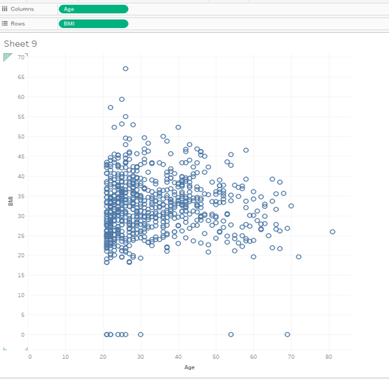
- Make a new sheet in Tableau. Drag Age (not the Age(bin) but the plain old Age from the Measures in the Data Values area) to the Columns, and drag BMI to the Rows. Tableau will give you SUM(Age) and SUM(BMI) and probably one single data point graphed. We circled in red for you below.
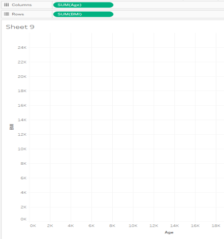
Alt text: graph
- We want to see all the data points, so let’s Disaggregate Measures. You can do this under the Analysis Menu. (This is the fix anytime you expect lots of data points and you only have one.)
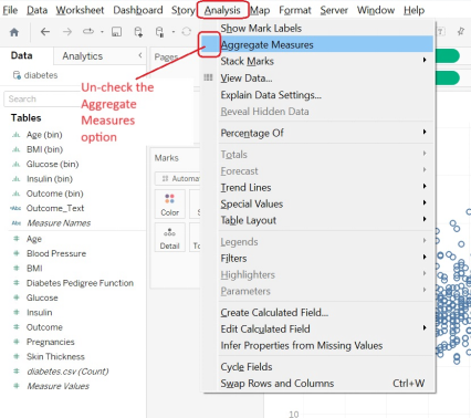
Alt text: Analysis
- We can now see an XY scatterplot of BMI vs. Age, with Age on the x-axis. Apply a filter for BMI so that BMI is allowed to be between 1 and the highest value (this removes BMI values of 0).
Alt text: scatterplot
- We want to do two-dimensional clustering. Are there distinct groups, such as
- Younger people with lower BMI?
- Younger people with higher BMI?
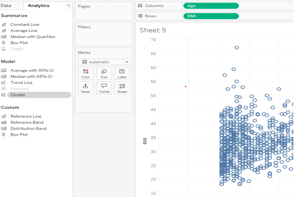
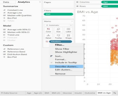
- To do this in Tableau, we need to switch from the Data tab on the left to the Analytics tab. From there, under the Model options, we want “Cluster.”
Alt text: cluster
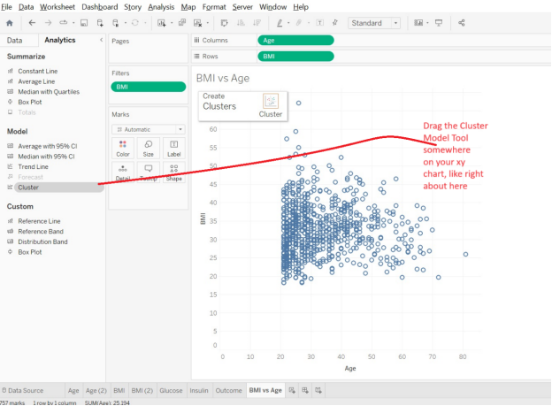
Drag the “Cluster” tool into the middle of your XY s
Alt text: cluster
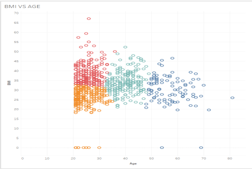
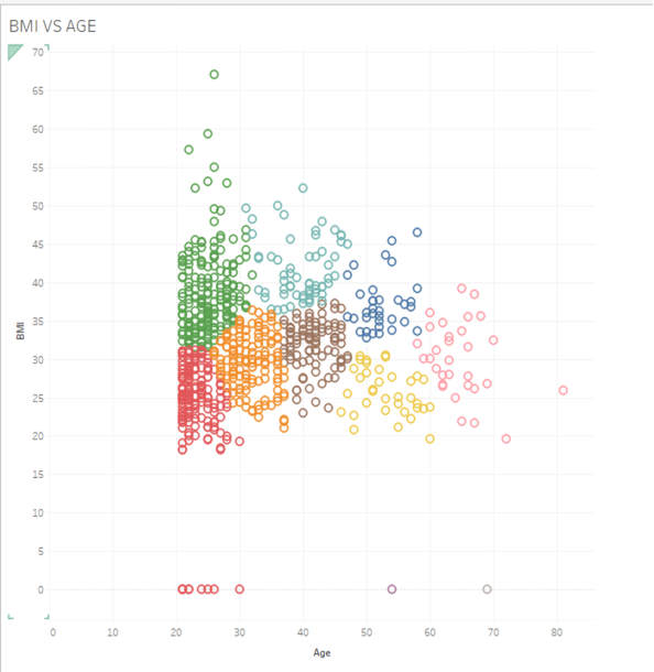
- Tableau will automatically create some clusters for you. It groups similar data points together so that people of a similar age and BMI will be in the same cluster while people with different ages and different BMI will be in different clusters.
Just looking visually at the four clusters Tableau automatically made, we can see the yellow one on the bottom left is younger people with lower BMI while the aqua one on the right-hand side is older people with lower-to-medium BMI. The red cluster is younger people with higher BMI.
Alt text: cluster
- If you like, you can experiment and drag the Clusters Mark onto the Shape Mark, and then the clusters will be distinguished by multiple X, O, and + icons and others which do not require color to differentiate them.
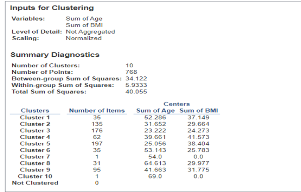
- We can get numeric descriptives on our clusters to help us understand them. Go to Clusters -> Describe Clusters. Here, we see that there are four clusters. Cluster 1 has 197 people in it, the median age is about 41 years old, and the BMI in this cluster is centered around about 34.
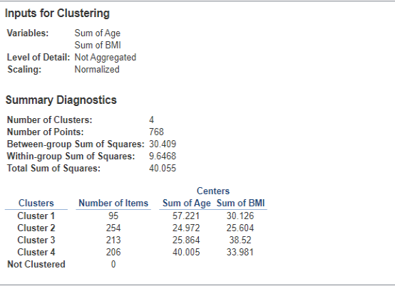
Question 11: Cluster Analysis for BMI vs. Age
Look at the BMI vs. Age Clusters created above, with a model of 4 clusters. If you had a data point with an age of 27 and a BMI of 42, which cluster would you expect to be the best match?
- Cluster 1
- Cluster 2
- Cluster 3
- Cluster 4
- None of these
| Question 11 Answer: | C. Cluster 3 |
- Let’s stay with our BMI vs. Age Clusters. Let’s say we want more clusters in order to more finely analyze our data. Under the Marks menu, go to Clusters -> Edit Clusters, and change the number of clusters to 10.
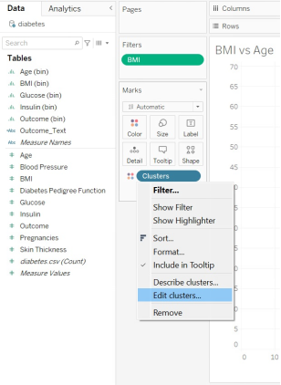
Alt text: Clusters
Question 12: Changing the Numbers of Clusters
Look at your new clusters, with 10 of them now on your XY scatterplot. What is the average age of those in the cluster with the highest BMI?
- About 26
- About 29
- About 51
- About 52
- Cannot determine from available information
| Question 12 Answer: | About 29 |
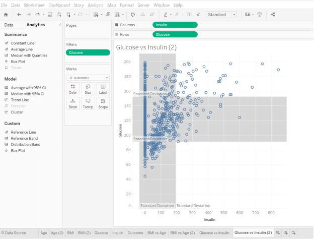
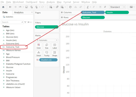
- Let’s make a new sheet and investigate Glucose vs. Insulin.
- Make an XY scatterplot with Insulin on the x-axis (because we can administer insulin) and Glucose on the y-axis (because that’s our outcome variable)
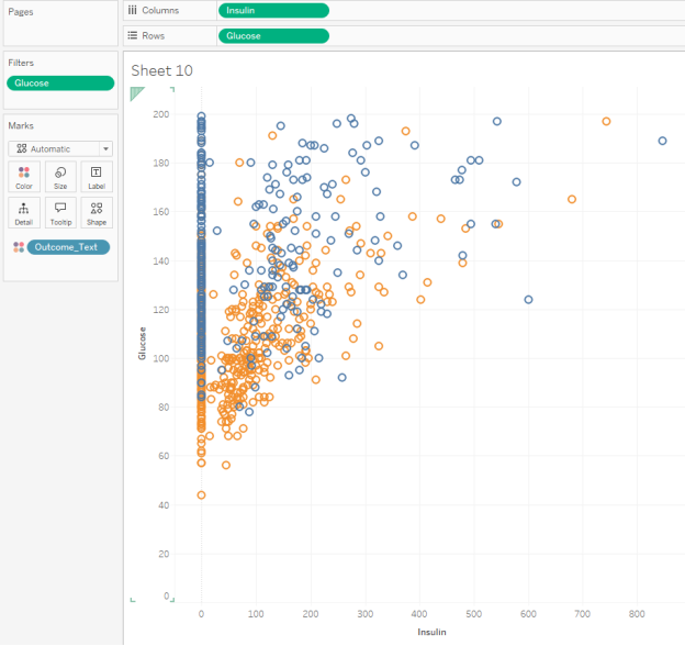
- Add filters to remove 0 values for Glucose (because a zero blood-glucose reading does not make sense).
- Do not add filters for insulin. It’s OK if the amount of insulin administered is zero.
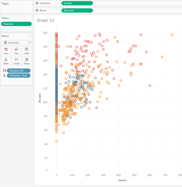
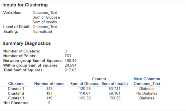
- Have Tableau make 3 clusters.
Question 13: Mapping Clusters to Measurements
Normal blood glucose levels are about 100 in a fasting non-diabetic adult. Which cluster best represents this?
- Cluster 1, with an average Glucose reading of about 150 and an average Insulin value of about 54
- Cluster 2, with an average Glucose reading of about 100 and an average Insulin value of about 52
- Cluster 2, with an average Glucose reading of about 100 and 220 data points in it
- Cluster 3, with an average Glucose reading of about 161 and 347 data points in it
| Question 13 Answer: | Cluster 2, with an average Glucose reading of about 100 and an average Insulin value of about 52 |
Stay on your Glucose vs. Insulin sheet, but let’s add another piece of information. Drag your Outcome_Text variable (the one which declares “Diabetes” or “No Diabetes”) to the Columns area. This should now give you two panes of graphs, one with Diabetes and one with No Diabetes.
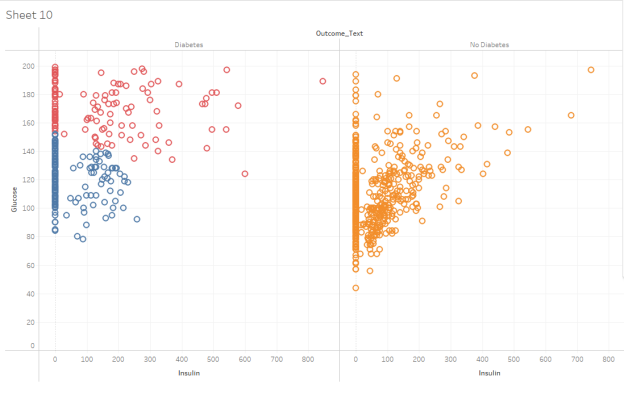
You should have two XY scatterplots of your Glucose vs. Insulin clusters, one with Diabetes and one with No Diabetes. Which statements would you support after inspecting these visualizations? Choose all that apply:
- Cluster 1 has an average Glucose level of about 150 in both the Diabetes and No Diabetes classifications.
- Cluster 1, with an average Glucose reading of about 150 and an average Insulin value of about 54.
- Cluster 2, which is generally lower insulin usage and lower Glucose levels, has some people with a Diabetes classification, but many more with a No Diabetes classification.
- Cluster 3 has very high insulin, very high Glucose levels, and only contains people with a Diabetes classification.
- Cluster 3, with an average Glucose reading of about 161 and 347 data points in it
| Question 14 Answer: | C.Cluster 2, which is generally lower insulin usage and lower Glucose levels, has some people with a Diabetes classification, but many more with a No Diabetes classification.D.Cluster 3 has very high insulin, very high Glucose levels, and only contains people with a Diabetes classification. |
Perform Distribution Analysis with Tableau
- We have now done EDA (exploratory data analysis) on this dataset, and we’ve also done some cluster analysis to look at relationships between two variables.
- Now we are going to look at distribution analysis.
- Sometimes it’s helpful to look for outliers, average levels, or other general distribution characteristics of a dataset. A Distribution Band can visually display that information.
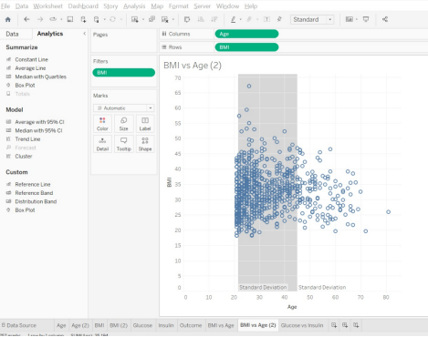
- Let’s go back to our BMI vs. Age dataset and graph. Remove any clusters and keep a filter on so that Tableau only displays data where the BMI is > 0 (do not display data with a BMI = 0).
Go the Analytics tab. Under Custom, choose Distribution Band. You want to drag this option to Table (Page) for this demonstration
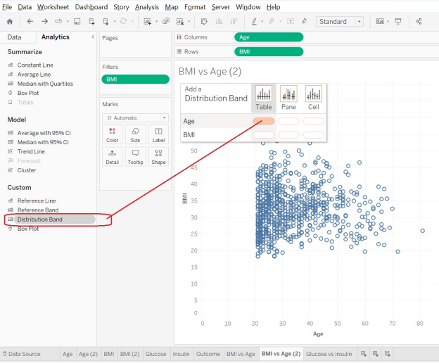
Alt text: cluster table
- You will be given some options. For this one, you want the scope to be the entire table, and we want +/- 1 Standard Deviation. (You will recall from statistics that if your data are normally distributed, about two-thirds of it will be within +/-1 standard deviation. This means that about 1/6 is above +1 STDEV, and about 1/6 is below -1 STDEV. So if something is “outside” of those bounds, it’s “a little bit different from average.”)
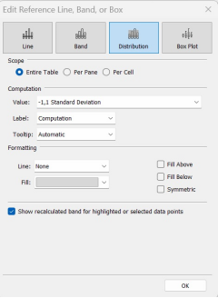
Alt text: Standard deviation
- That last step will put a reference band on the graph. It’s now easy to see which Age data points are “close to the average” (they are inside the grey band) and which data points are “outside of the average” (they are outside of the grey band.)
Alt text: Cluster
- Let’s go back and put on a reference band of +/-1 STDEV for the BMI as well. We get something like the following:
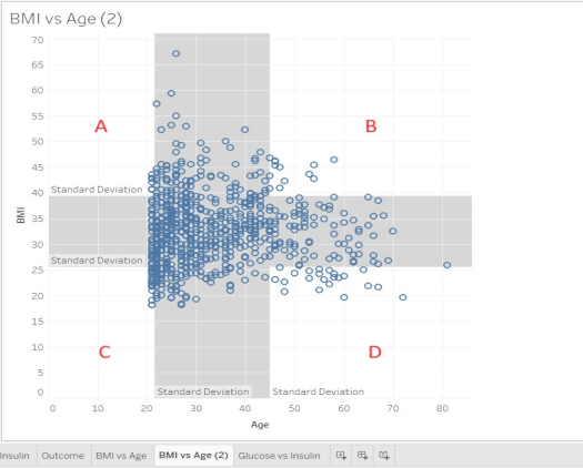
Question 15: Understanding the Distribution Bands
Look at the distribution band for the BMI vs. Age scatterplot. Match the area with its description.
Four Quadrants: A, B, C, D
Four Options:
- Lower age, Lower BMI
- Lower age, Higher BMI
- Higher age, Lower BMI
- Higher age, Higher BMI
| Question 15 Answer: | A. Lower age, Higher BMI → Quadrant BB. Higher age, Higher BMI → Quadrant DC. Lower age, Lower BMI → Quadrant AD. Higher age, Lower BMI → Quadrant C |
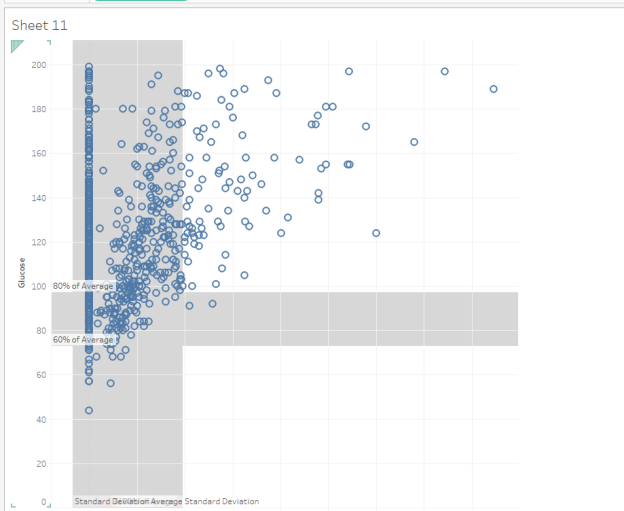
- Go make a new sheet, and this time, make a graph of Glucose vs. Insulin. Review these reminders:
- Insulin should be on the x-axis
- Glucose should be on the y-axis
- No clusters
- Filter so Glucose is 1 or higher
- Do not filter on Insulin (OK if Insulin values are 0)
- Add one +/- 1 STDEV Distribution band for the Insulin
- Add another +/- 1 STDEV Distribution band for the Glucose (you will do well to add them one at a time, at the Table level)
- You should get something that looks similar to this: